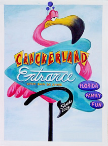
Celeste! Oh My Gosh! This is Amazing! It is wonderful to see some more work from you! Anything you touch turns to Gold! I will have to go with the poster of NO clouds. The clouds seem to give the ride an illusion that it is amazing...and we know its not. I think Gee Wizzy World should be the only park that reaches beyond the clouds. Crackerland is "Simple"... In my opinion... it needs to read to the audience that it is a simple theme park. What you see is what you get.
Clouds or no clouds, the coaster still looks likes its falling apart with the holes in the wood and the loose nails so the crappyness still shows through... still...gotta go with the clouds.
I'm going to agree with Kerry on this one and pick the one with no clouds. You do want to keep it simple for Crackerland and she's right the clouds kind of glorify Crackerland up a bit and we know Crackerland is not in the greatest shape-ha ha Though Lets see some of those beautiful clouds around Gee Wizzy World!!! Great work Celeste on the designs! It was an honor to meet you this past weekend! You are very talented!!


 Contact Creators
lavalle@traditionalanimation.com
les@traditionalanimation.com
Contact Creators
lavalle@traditionalanimation.com
les@traditionalanimation.com


WOW!!!!!!!!!!!!!!!!!!!!!!!!!!!!!!!!!!!!!!!!!!!!!!!!!!!!!!!
ReplyDeletei like the clouds one the best, but they both are really great!
Celeste! Oh My Gosh! This is Amazing!
ReplyDeleteIt is wonderful to see some more work from you! Anything you touch turns to Gold!
I will have to go with the poster of NO clouds. The clouds seem to give the ride an illusion that it is amazing...and we know its not. I think Gee Wizzy World should be the only park that reaches beyond the clouds. Crackerland is "Simple"... In my opinion... it needs to read to the audience that it is a simple theme park. What you see is what you get.
Clouds or no clouds, the coaster still looks likes its falling apart with the holes in the wood and the loose nails so the crappyness still shows through... still...gotta go with the clouds.
ReplyDeleteI'm going to agree with Kerry on this one and pick the one with no clouds. You do want to keep it simple for Crackerland and she's right the clouds kind of glorify Crackerland up a bit and we know Crackerland is not in the greatest shape-ha ha Though Lets see some of those beautiful clouds around Gee Wizzy World!!! Great work Celeste on the designs! It was an honor to meet you this past weekend! You are very talented!!
ReplyDelete